Trinity.fi
Dual-reward Staking Protocol
My Role
Brand & Product Designer — Brand Design, Prototyping, Interactive Design, UI Design, UX Research
Team
1 Project & Marketing Lead
1 Fullstack Developer
1 Product & Brand Designer (Me)
Overview
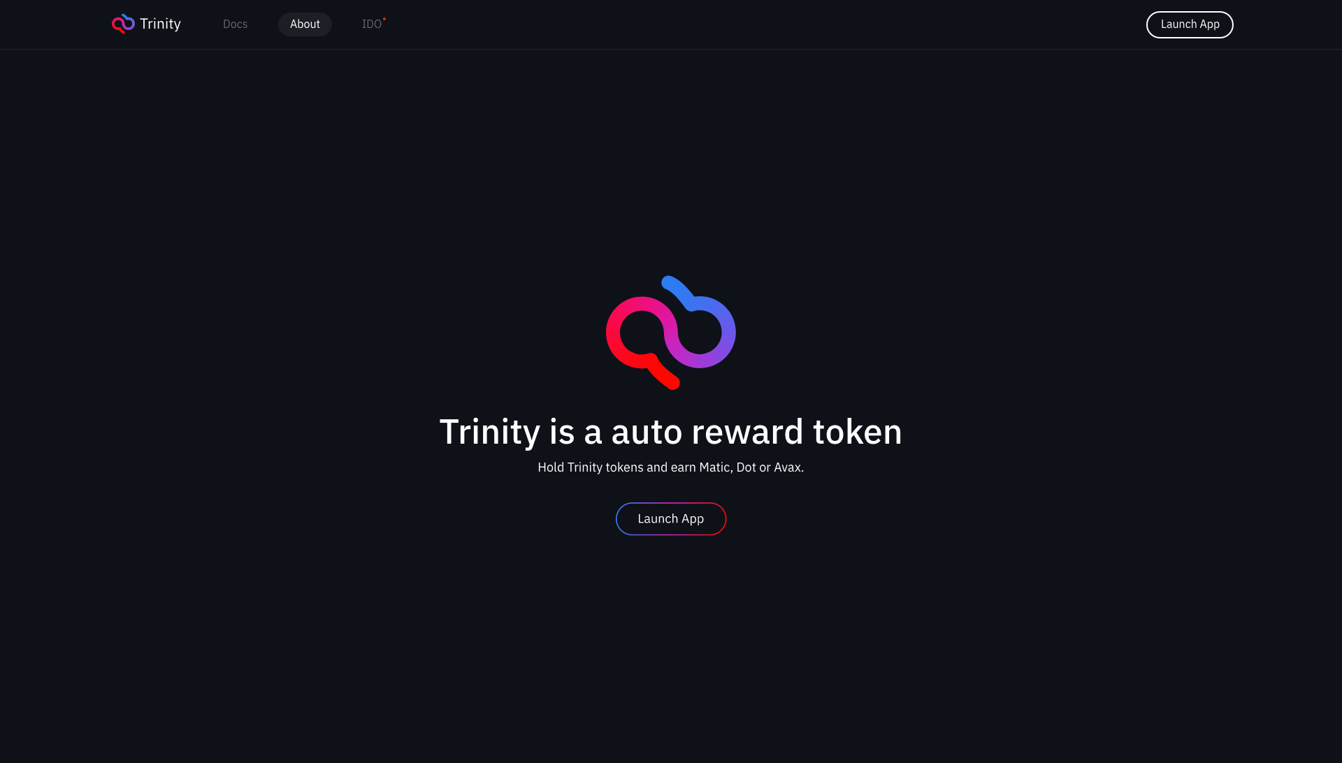
Trinity is a Web3 crypto project designed around choice, where holding the token Trin allows users to receive rewards from a selection of three tokens: Matic, Avalanche (AVAX), and Polkadot (DOT).
What makes Trinity unique is that users can claim rewards without staking, although staking is available to increase yields. As the Brand and Product Designer, I was responsible for the branding, web design, dApp for reward selection, and staking interface, as well as an ambitious NFT VR museum built in Unity.
LOGO AND BRANDING
Crafting the Visual Identity of Trinity
Choose a pill 💊
Overview
The visual identity for Trinity was built around the core concept of choice and flexibility, much like the theme of the Matrix films. The brand’s logo and color palette had to resonate with users who are not only looking for a reliable crypto platform but also seeking something that stands out in the crowded DeFi space.

The branding focused on blending futuristic elements with familiar visuals, creating a distinctive and memorable identity.

The color palette was carefully chosen to ensure it reflected both the platform's theme of choice and the vibrant, modern look needed for a Web3 audience.
Modular Approach
The logo design took a modular approach, symbolizing the flexibility that Trinity offers through its reward selection system. The idea was to create a logo that could adapt dynamically across different touchpoints—on the web, in staking platforms, and in marketing materials. The logo uses geometric shapes that morph slightly depending on user interactions, especially in the dApp and staking pages.
Color Palette Development
The red and blue color palette was a direct homage to the Matrix films. The blue pill/red pill symbolism was carried through into the overall brand identity, with the Polkadot pink-violet tone acting as a midpoint between these two extremes. This gave the logo a unique and futuristic appearance while staying true to the DeFi culture.
WEB DESIGN
Clean, Minimalist, and Efficient
Key Components
Overview
The web design for Trinity was developed as the platform’s gateway, combining branding elements, seamless navigation, and responsiveness for both desktop and mobile. Since the audience was crypto-savvy, the focus was on creating a streamlined and intuitive interface that quickly directed users to key platform features.

Contrast and readability were key focuses, especially for mobile users accessing the site in varying conditions.

The design prioritized quick load times and smooth performance, even on slower networks.
Simplicity and Trust
Given that the target audience is typically cautious about security, the design needed to inspire confidence. This was done through a minimalist structure with clear, bold headings and interactive elements like wallet connection buttons that respond to user actions (e.g., color changes when hovered).
Performance
Since many crypto users access platforms on the go, the site was optimized for mobile and low-latency environments. CSS was minimized to ensure fast load times, and lazy loading was used to enhance performance, especially for the staking and reward selection sections.
User Authentication
Integrated with Moralis, the site allowed quick wallet connections (e.g., MetaMask) with minimal friction. The design ensured the login flow was as simple as possible, prioritizing speed and user retention.
WEB3 DAPP
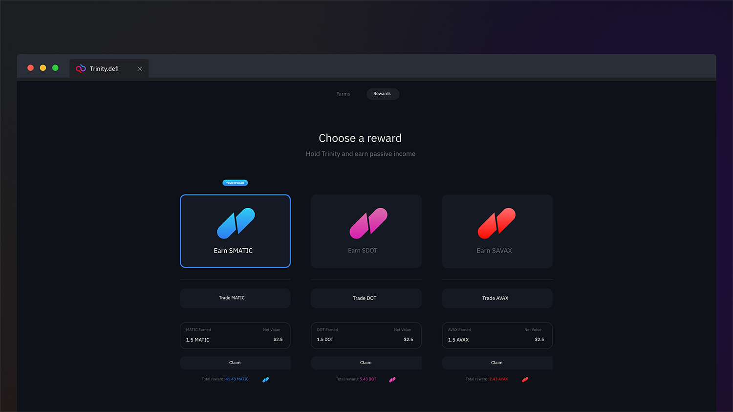
The Reward Selection dApp
A Dynamic Token Distribution Platform
Overview
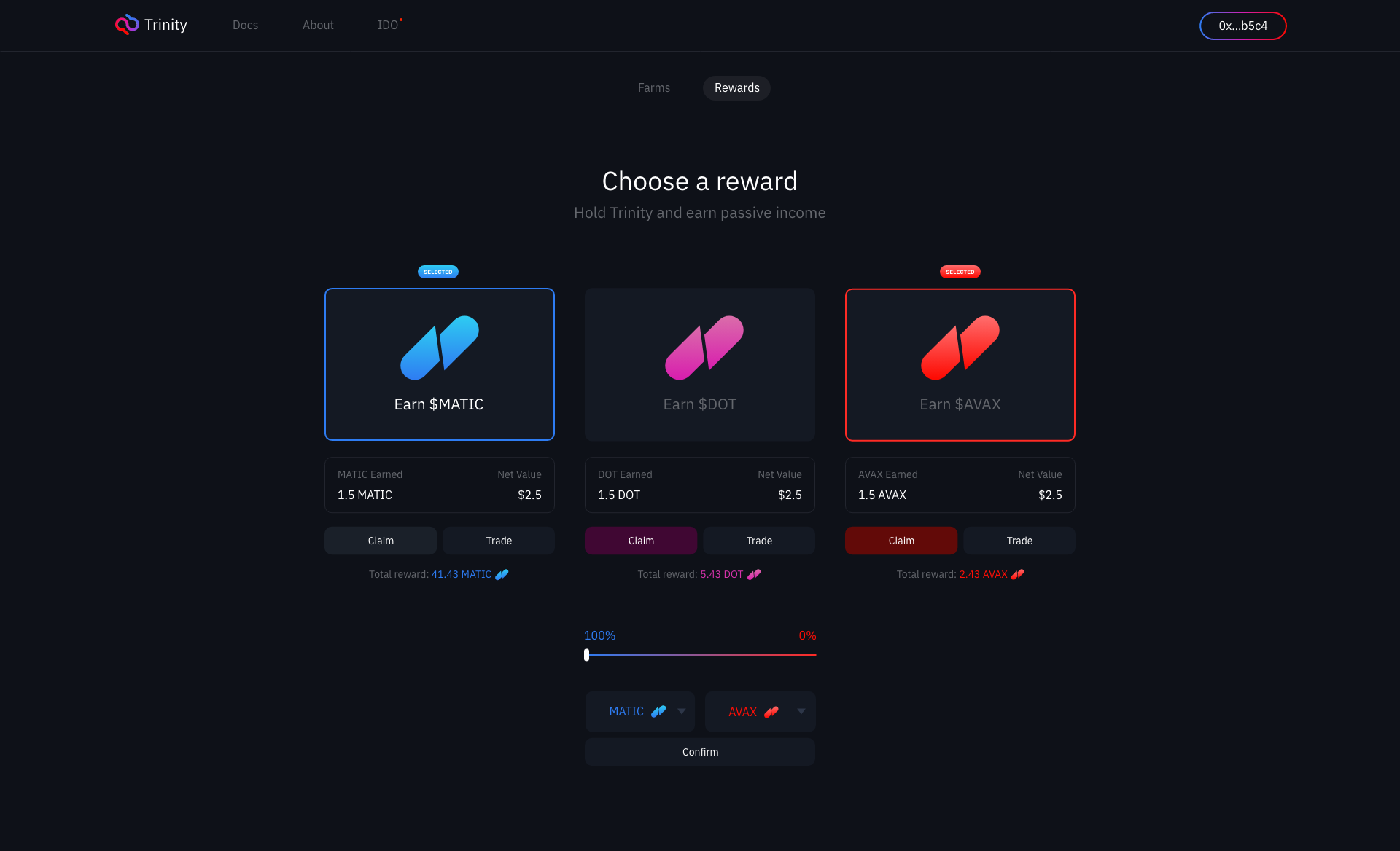
At the heart of the Trinity platform is the reward selection dApp, where users can customize the distribution of their rewards between two out of the three available tokens: Matic, AVAX, and DOT. This decentralized application (dApp) was designed to be intuitive but powerful, giving users full control over their reward structure.

Simplifying the reward selection to two tokens helped streamline the user experience.

Real-time feedback was implemented to show users how their choices would impact potential earnings.
Core Features
Dual Reward System: Users select two tokens from the available three and choose the distribution percentage (e.g., 40% Matic and 60% AVAX). The dApp calculates potential returns based on real-time token prices.
Real-Time Adjustments: Powered by Moralis for real-time token data, users can see live updates to their potential earnings as they adjust the percentage sliders for each token.
Design Challenges and Solutions
One of the main challenges was to offer users flexible control over reward allocation without overwhelming them. We initially used a dual-slider interface, but user testing revealed that some preferred manual input fields. Both options were retained, allowing users to either drag sliders or enter exact percentages.
It was essential that users could see their rewards update in real-time based on token prices. To achieve this, we leveraged WebSocket connections through Moralis, allowing for instant feedback as users adjusted their reward distribution.
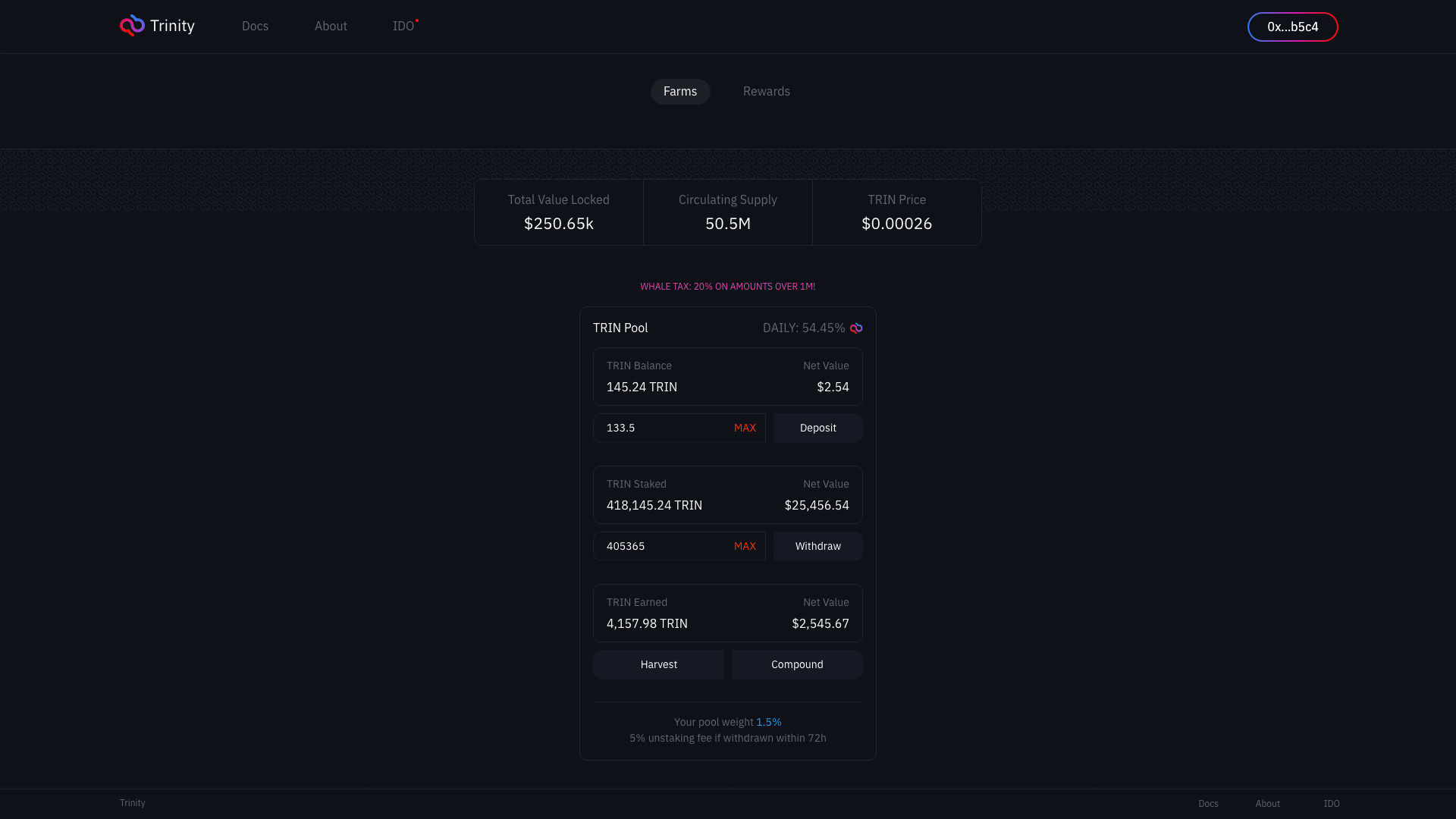
STAKING
The Staking Interface
Enhancing Returns Through Token Locking
Overview
While users could earn rewards without staking, the staking interface was designed for those seeking to increase their returns by locking up their Trin tokens.
This part of the platform required a separate, focused design since staking involves complex financial decisions and needs to provide clarity on APY (Annual Percentage Yield) and lock-in periods.

The interface provides live updates to ensure users always see the most accurate staking data.
Interactive design elements were added to encourage users to engage with the staking features.
APY Visualization
The staking page prominently displayed the live APY based on staking pools and the number of tokens staked. This allowed users to compare their potential earnings from staking versus holding without locking.
Staking Amount Selection
A clean, user-friendly slider allowed users to select the exact number of Trin tokens they wished to stake. A summary panel immediately showed the expected rewards, potential APY, and lock-in duration.
Information Clarity
Since staking involves more risk (i.e., locking funds for a period), we needed to ensure that all the relevant information—such as APY, lock duration, and early withdrawal penalties—was easily accessible and understandable. Tooltips and hover effects were added to give users additional context without cluttering the interface.
Conclusion
Trinity stands as a testament to how innovative design, branding, and technology can come together to create a user-centric Web3 platform. From the Matrix-inspired branding to the clean, intuitive interfaces for reward selection and staking, the project successfully merged technical complexity with user-friendly design.
The integration of Moralis for real-time blockchain interaction ensured a smooth experience for users, while the platform’s unique approach to reward customization provided a level of flexibility that set it apart from other DeFi platforms. Through thoughtful design choices and seamless user experiences, Trinity achieved a balance between form and function, making it a standout project in the evolving Web3 space.
Do you want to see more about it? Feel free to browse the file here.